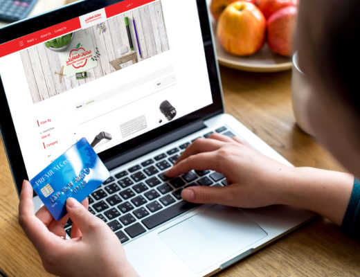
When it comes to online shopping, the checkout page is critical. Customers complete their purchase here, enter their payment and delivery details, and then click the required Buy button.
But nearly 70% of online buyers abandon the checkout process without making a purchase. One of the main reasons is the inconvenient checkout procedure, which can occur due to a variety of errors. When your checkout page isn’t tailored to your customer’s requirements, it’s one of them.
How Customizing Checkout Enhances Shopping Experience?
Even if your checkout page is flawless in terms of ease of use, it is important to go above and beyond for your customers by customizing it.
It is necessary to customize your checkout page. You can customize it to suit your company’s requirements and prove to your customers how much you value their shopping experience. Giving your customers what they want increases the likelihood of a successful purchase.
Target markets and companies have unique characteristics. For this reason, the typical checkout process—which asks for a name, email, phone number, and shipping address—may not always suffice. Nobody knows your customers as you do. Why not meet their demands at one of the most important points in the buying process?
Now that you know why to add custom fields to your checkout page, let’s improve your checkout process and get paid faster using 5 easy ways.
Let’s illustrate,
Make the “checkout” step clear and visible.
The location of the payment form should be very clear to your customer before they reach it. Check your website to ensure that each page provides a clear shopping cart path and instructions for visitors to complete the purchase. To get people to notice the actions you want them to take, try choosing bold colors for buttons like “add to cart” or “buy now.”
In addition, maintaining consistent branding throughout the site will not only benefit your marketing efforts but also your customers’ trust and loyalty. When you click the Pay Now button, the site you’re going to doesn’t look like the site you started on, which is the most worrying thing that can happen. To help you finish the sale, it’s essential to ensure that all fonts, colors, and button styles are consistent across the entire experience.
Communicate accurately.
No one enjoys starting an online form without knowing how long it will take, or worse yet, clicking submit only to discover there are more fields to fill out on the second page!
Be as transparent as possible throughout the entire process by including distinct progress indicators. To set the right expectations with your customers, you can do this by including a “percent complete” bar at the top of the page, indicating the total number of pages there are, or changing the copy of the button to “continue” from “submit”.
Make payments possible without the need for an account
Although user accounts are a great way to help your customers complete the checkout process more quickly by saving their data, preferences, and activity. The second most common reason for cart abandonment, with a 37% usage rate, is account requirements. Nobody really likes remembering another login and password, and convincing first-time shoppers to sign up for an account can be a huge motivator to drive out.
Minimize customer effort.
How many fields are necessary to complete the checkout process? More than seven is probably too many. Studies show that the perfect checkout flow may be accomplished in just 7 fields, compared to the average of 15 utilized for online purchases. Look at the details you’re requesting and eliminate anything that isn’t absolutely necessary to finish the transaction.
Make mistakes simple to correct
Have you ever filled out a lengthy online form, hit “Submit,” and then received a notification in bright red that something went wrong? The last thing you want to do is go back through the form to find your mistake. By giving very specific, welcoming prompts if there is a problem with a form field, you may help your consumers experience face less friction. Ensure the incorrect field is identified clearly and there are instructions on how to fix it.
Making the experience as simple as you can for your clients is the key to it all, once more. Although to some it may seem like a technical afterthought, the way your consumers interact with your forms and the language you use to guide them through them are two crucial components of your entire customer experience that should not be overlooked.
Even though the checkout page on your website could appear to be a technical checkbox on a lengthy list of factors to take into account, it plays a significant role in the general satisfaction of your clients.
If you’ve just launched your online store or have questions before launching, feel free to contact us at zVendo.


