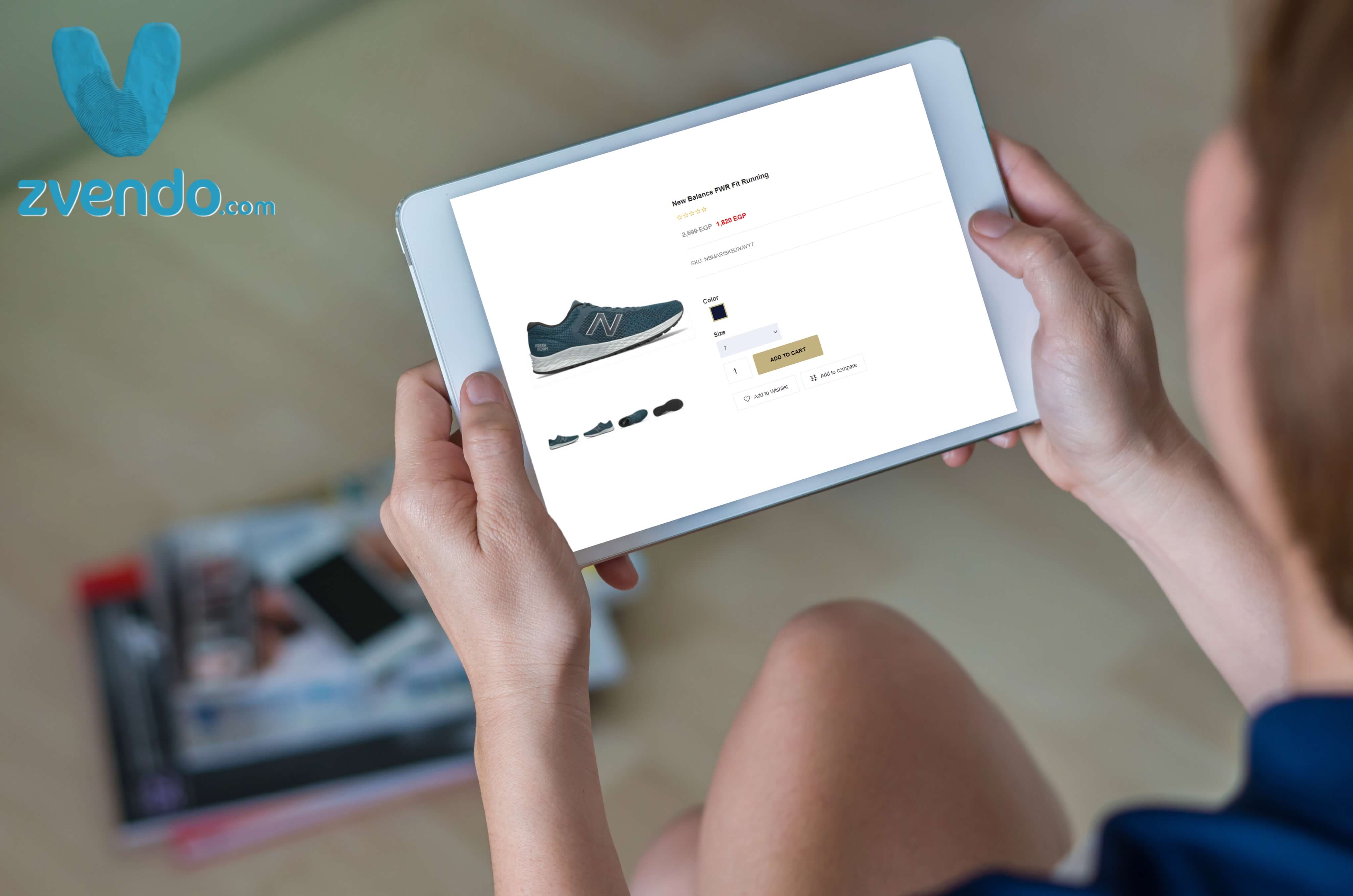
The product page is where most of your buyers take the final decision to buy or not buy your product. However, it’s a section of the sales funnel that’s frequently overlooked. so, you must focus on an important fact, your product pages are also your sales pages if you’re running an eCommerce business.
Good product pages help convert visitors into buyers. Additionally, they help provide your customers with the details they need to make an informed purchasing decision.
Here are 6 tips and reasons that can be your roadmap to how to improve your product pages.
1- Provide perfect product descriptions and perfect product pictures.
When customers shop online, they do not have the ability to inspect the product and see it in real. They are forced to rely on the images you provide, along with whatever description you have.
Therefore, the images and descriptions must be meticulously designed with every small detail to attract buyers to the item. If your image resolution is poor or relies solely on technical descriptions, and not in a simple way that is easy for shoppers to understand, you will lose a lot of sales because you will fail to attract interest in your products.
2-Understand and respond to customer concerns.
When deciding what information to include on your product pages, keep in mind that there is a connection between the product, your customer’s reasons for buying it, and their objections that may delay the purchase.
Additionally, addressing shared interests can help you better set expectations and thus reduce the number of returns on a product. Your support team will be grateful for your efforts to reduce customer complaints, which are primarily caused by receiving a product that does not meet their expectations.
3-Use eye-catching ‘Add to Cart’ buttons.
If a customer can’t find the button to make a purchase clearly, how can they? Even for those who aren’t familiar with the internet, the Add to Cart button should be obvious.
Your call-to-action buttons should be large, with a bold font and a color that stands out from the rest of the page. Also, they should be placed in places where visitors can easily find them, preferably at the top of the page so that they don’t have to scroll.
4-Create a sense of urgency.
To your surprise, creating a sense of urgency for your eCommerce store can have more of an impact than you expect. According to Conversion XL, adding scarcity and urgency can boost purchases by up to 332%. And to high your conversion rate too.
A sense of urgency helps quickly convert a regular browser into a buyer. Customers will be motivated by a great product when they browse your store. To counter this, display a sale countdown timer on your page to entice customers to buy now.
5-Reviews and personal testimonies should be presented.
Customer testimonials are even more important if the product is based on delivering a certain result. On the other hand, reviews have proven to be crucial in building trust in almost every product area.
It can be difficult to convince customers to leave their testimonials or reviews, but it is well worth the effort. The credibility and confidence that potential buyers feel when they read 45 customer reviews, most of them positive, push them to take a fast decision.
6- Integrate a simple Layout.
Even if your customer is not familiar with the Internet, they should be able to use your website. There is a standard product page layout that your online store should use. Don’t use funky and impractical layouts as they may confuse or frustrate customers. Keep a direct approach.
When choosing a theme for your store, make sure it is similar to other popular websites in your niche. While many would advise you to “stand out,” this is often incorrect advice when it comes to product page layouts.
Finally, product pages are vital to the success of your e-commerce venture. It is possible that if your documents are not organized or displayed incorrectly, you will frustrate your customers and lose a lot of money.
And always remember that One of your biggest opportunities to influence customer purchasing decisions is through your product pages. Spending the time to make them effective will pay off in the form of increased sales and content customers.
If you’ve just launched your online store or have questions before launching, feel free to contact us at zVendo.


