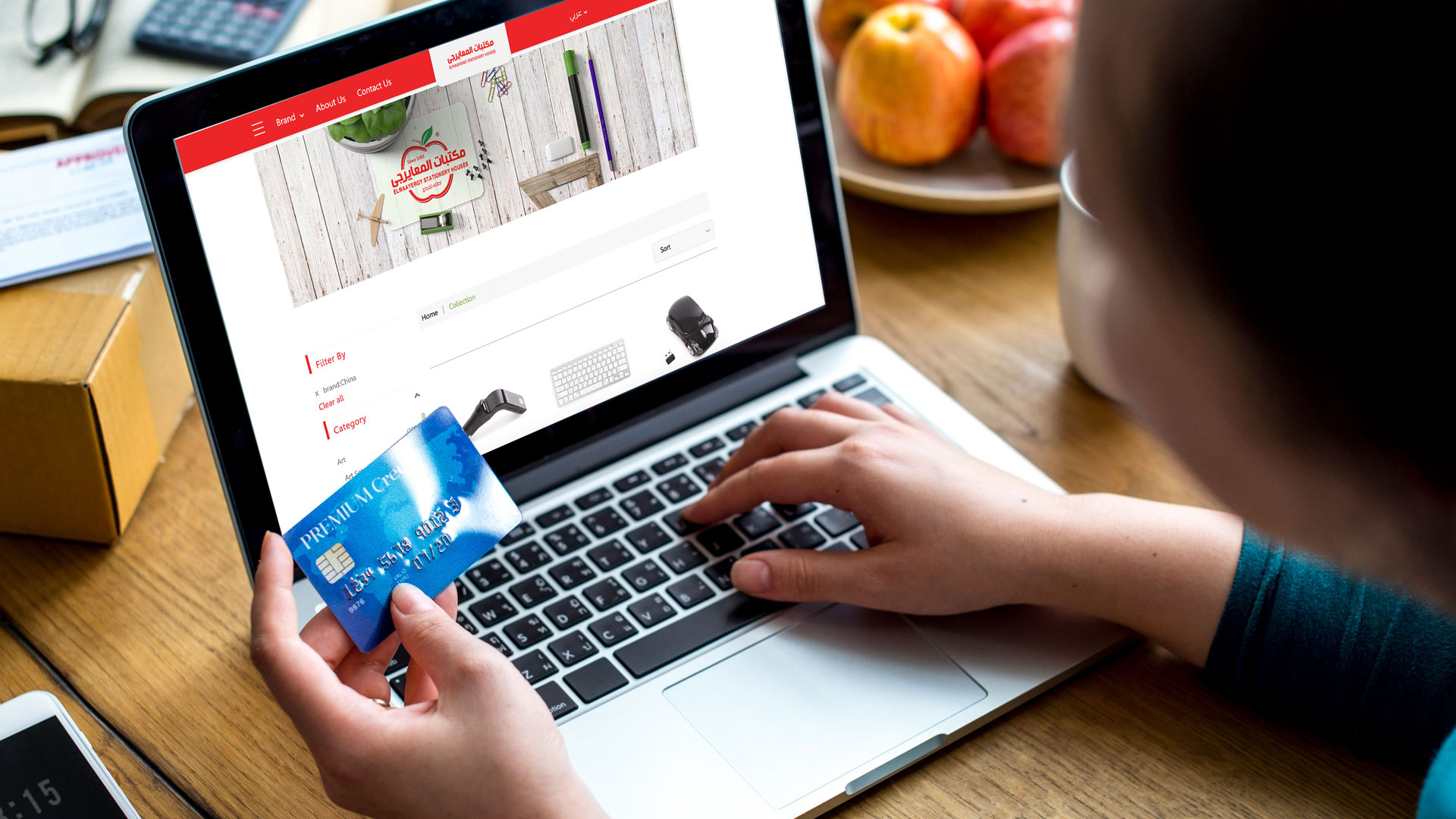
Shopping today is a lot different than what it was in the past, consumers today have the option of choosing between multiple different places and ways to get the item they’re looking for, they can pick between a huge variety of marketplaces that serve the same product by scrolling through their phone, so between all the swiping you’re going to need something to attract their attention instantly and make shopping experience nice and easy for them, having a user-friendly interface that can walk them through the whole process from A to Z the moment they think about buying something, they should be able to easily locate it and find a clear path towards placing that order, and you don’t just stop there, you should also make it easy for them to find similar products that they could be interested in to make sure that all their needs are covered,
With that in mind, you should also focus on a few other pointers that will greatly increase the user experience, making sure that your website is working fine and glitch-free and that it’s fully compatible
With a mobile version as well and that all the screens load quickly as a customer could lose interest in a matter of seconds during the buffering page.
Focus on navigation and don’t forget about site search.
Add good quality pictures as much as possible for your products as online shoppers can’t see the items in person they’re going to need to see exactly what they’re ordering you can also add pictures for your products in different angels and a clear description.
Including customer reviews is a great way to show credibility, reading about a previous consumer’s experience is going to matter a lot when it comes to making the decision to purchase and place an order.
“Customers should be able to easily navigate an organization’s website,”
Says Ali Mirian, senior vice president of Product, Collective Bias, a marketing & shopper social media company.
_
Consider all consumers’ types (Implementing a short and specific shopping process)
Today’s consumers are busy, time-sensitive, have no time for a detailed and long shopping process that won’t really positively affect their buying decisions as much as it would negatively affect your sales as a merchant, as paying too much thought into throwing off multiple steps for consumers to complete to reach the checkout step is not positive as much merchants would think, considering nowadays consumers, think about as few steps as possible for them to shop, choose a product, add to cart, and then proceed to checkout in less than a minute.
That would be easy to implement with an easy online store layout, with products varieties clear on the landing page, menus, categories visible, prominent call to action button, multiple product options as colors underneath the same product, to decrease customers having to search for a specific color or size, and clear pricing for every option, with a clear add to cart button that would automatically open a visible window for consumers to access their carts, and that they won’t have to look for the cart all over your online store.
Adding related products or “People also search for” tool, following consumers choosing a specific product to buy, to influence consumers to buy more than one product or products in sets, is an excellent way to increase cart quantity without consumers even noticing their actions.
Return and refund policies
As mentioned before, consumers don’t get to touch or feel the products, that is why you need to support their buying decisions with prominent guarantees and clear return and refund policies, so they would be more willing to buy the product trusting they can exchange or return it within a specific time period.
Easy to access contact information and a dedicated chat button
As a merchant, providing clear contact information in your online store footer or a sole page that is anchored and redirects to the online store footer that is visible on every page, so that the contact information, as well as chat buttons, stay with the customer throughout their shopping process, is one of the most important parameters of providing an effective online shopping experience to your consumers, as your customers will have to know you are real and that you are with them constantly to assure them of their buying decisions, also a dedicated chat button that appears on all pages, with a personalized message, is easily one of the most effective techniques.
Use mobile applications
Did you know that almost 50% of online shopping is done through mobile phones?
Mobile phones increase customers’ loyalty, and reduce cart abandonment, due to the easy-to-access online store through their mobile phones, everywhere, and anytime, and the easy layout of mobile phones in general, that by turn affects the checkout process, so having an online store that can operate as a mobile application is one major way to maintain customers traffic and increase your online sales.
Let customers choose their delivery date
What better way to convince customers to buy online than to let them choose the most convenient time for delivery?
That is implementing “Time-slot delivery”, in your online store, which is a tool for consumers to choose the time for delivery they want during the checkout process, after they add a product to cart, that way you can give your customers options that will positively affect their buying decisions.
Offer more than one payment method
Customers will more likely to complete the shopping process when they find multiple payment options at checkout, from cash on delivery, or online payment through multiple payment gateways, and to support installments for relevant products when needed.
Every customer can proceed to checkout
Customers don’t have to be registered customers to complete the checkout, as welcoming every new guest customer to checkout is an effective means to reduce cart abandonment.
Save the cart for when customers are ready
Your online store should be made to save customers cart items, so they can easily return back to them if they are ready to proceed to checkout, implementing effective techniques as wish-lists and compare-lists can act parallel to this technique.
No hidden costs
You have to eliminate extra costs as much as you can at checkout, as one of the main causes of cart abandonment is customers finding extra money they have to pay than what was promised before checkout, you have to make sure that the promised total amount before they clicked “Add to cart” is exactly the same after they proceed to checkout, excluding the shipping fees.
Support free shipping, and promotions
Every now and then make sure to add a free shipping on specific products, or according to cart quantity, as well as promotions for specific cart quantity or according to order values, to motivate your customers and reduce cart abandonment.
Need more similar articles?
Check out our other articles and subscribe to our newsletter.


No Comments